
back
Context
Overview
Design Principles
Visual Direction
Design
Outcome
Final Thought
Website
A new website for a PR agency that outgrew its old one

PROJECT
Corporate Website
TIMELINE
Sep 2024
4 months
role
UI/UX Designer
Team of 2
SKILLS
Website Design
Interaction Design
Visual Design
Overview
A digital reset for a growing regional PR agency that had outgrown its site and its old positioning
PRecious now works as a business consultant that uses communication to solve business problems, not only as a PR agency. The old site couldn't reflect that shift, or keep up with its growing markets, services, and body of work.
The client also felt the site was boring and lacked personality. The new site needed to feel colourful and distinctive, while still making it easy to understand what PRecious does.

information architecture
Grouping a long list of services into a clearer website structure
We reviewed the existing content and reorganised the website around solutions, resources, work, people, and regional presence.
This made it easier to show PRecious as an integrated marketing agency: a team of consultants with different areas of expertise, brought together based on each client’s business needs.

Visual direction
An idea taken from the PRecious logo
PRecious did not have an existing brand guideline that could be directly applied to the new website. We used the square framing the PR letters in its logo as the starting point for a website-specific key visual.
By resizing, stretching, and overlapping this square, we created a flexible set of rectangular gradient blocks. Their changing proportions and overlaps reflect the breadth of PRecious' services and the way different practices work together.

Adapting the key visual across pages and components
The blocks can be adjusted for different page layouts and UI components. This keeps the website visually consistent while accommodating a wide range of content.


Colour and typography
Extending PRecious' brand blue with a softer palette and expressive type
We kept PRecious' brand blue and paired it with a muted colour palette to create a calm base for the website. Brighter gradient accents are used selectively to highlight key moments and add a fresher tone.
The typography follows the same approach: clear and structured enough for a content-heavy website, with large headlines and contrasting text sizes to give the layouts more energy.


Interface
Carrying the identity across every page of the website
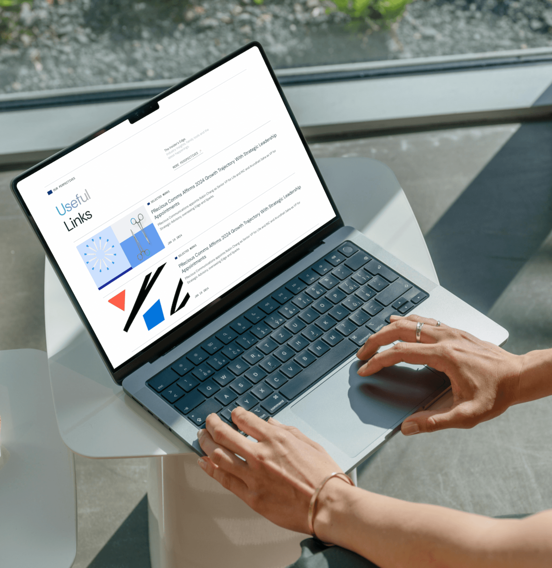
The homepage introduces the identity in full: the agency's positioning, services, expertise, and regional presence. From there, the same modular system carries through the solutions, resources, work, people, and regional pages, adapting to each type of content without repeating the same visual pattern




Guidelines
Designing for long-term maintenance
Country sites often reuse the same articles. But each market needs its own images, ones that fit its own audience. So we made simple guidelines for choosing photos: real people, real moments, nothing too staged.
We also made a guide for using visual patterns in content, so every market still feels part of the same site.


The result
A clearer way to show PRecious as a regional communications partner, not just a PR agency
The new site brings a broad service offer, a growing body of work, and multiple local markets into one system built to evolve.
The site is live today: Visit PRecious Communications →

If you'd like to see the full process, from early research to design refinements and motion prototypes, feel free to reach out. I usually walk through the detailed exploration during interviews or casual portfolio chats.
Website
A new website for a PR agency that outgrew its old one
PROJECT
Corporate Website
role
UI/UX Designer
Team of 2
TIMELINE
Sep 2024
4 months
SKILLS
Website Design
Interaction Design
Visual Design
Overview
A digital reset for a growing regional PR agency that had outgrown its site and its old positioning
PRecious now works as a business consultant that uses communication to solve business problems, not only as a PR agency. The old site couldn't reflect that shift, or keep up with its growing markets, services, and body of work.
The client also felt the site was boring and lacked personality. The new site needed to feel colourful and distinctive, while still making it easy to understand what PRecious does.
information architecture
Grouping a long list of services into a clearer website structure
We reviewed the existing content and reorganised the website around solutions, resources, work, people, and regional presence.
This made it easier to show PRecious as an integrated marketing agency: a team of consultants with different areas of expertise, brought together based on each client’s business needs.
Visual direction
An idea taken from the PRecious logo
PRecious did not have an existing brand guideline that could be directly applied to the new website. We used the square framing the PR letters in its logo as the starting point for a website-specific key visual.
By resizing, stretching, and overlapping this square, we created a flexible set of rectangular gradient blocks. Their changing proportions and overlaps reflect the breadth of PRecious' services and the way different practices work together.
Adapting the key visual across pages and components
The blocks can be adjusted for different page layouts and UI components. This keeps the website visually consistent while accommodating a wide range of content.
Colour and typography
Extending PRecious' brand blue with a softer palette and expressive type
We kept PRecious' brand blue and paired it with a muted colour palette to create a calm base for the website. Brighter gradient accents are used selectively to highlight key moments and add a fresher tone.
The typography follows the same approach: clear and structured enough for a content-heavy website, with large headlines and contrasting text sizes to give the layouts more energy.
Interface
Carrying the identity across every page of the website
The homepage introduces the identity in full: the agency's positioning, services, expertise, and regional presence. From there, the same modular system carries through the solutions, resources, work, people, and regional pages, adapting to each type of content without repeating the same visual pattern
Guidelines
Designing for long-term maintenance
Country sites often reuse the same articles. But each market needs its own images, ones that fit its own audience. So we made simple guidelines for choosing photos: real people, real moments, nothing too staged.
We also made a guide for using visual patterns in content, so every market still feels part of the same site.
The result
A clearer way to show PRecious as a regional communications partner, not just a PR agency
The new site brings a broad service offer, a growing body of work, and multiple local markets into one system built to evolve.
The site is live today: Visit PRecious Communications →
If you'd like to see the full process, from early research to design refinements and motion prototypes, feel free to reach out. I usually walk through the detailed exploration during interviews or casual portfolio chats.
thucxdoan@gmail.com
Updated Aug 1, 2026